On the Contrary
ONE PERFECT T-SHIRT.
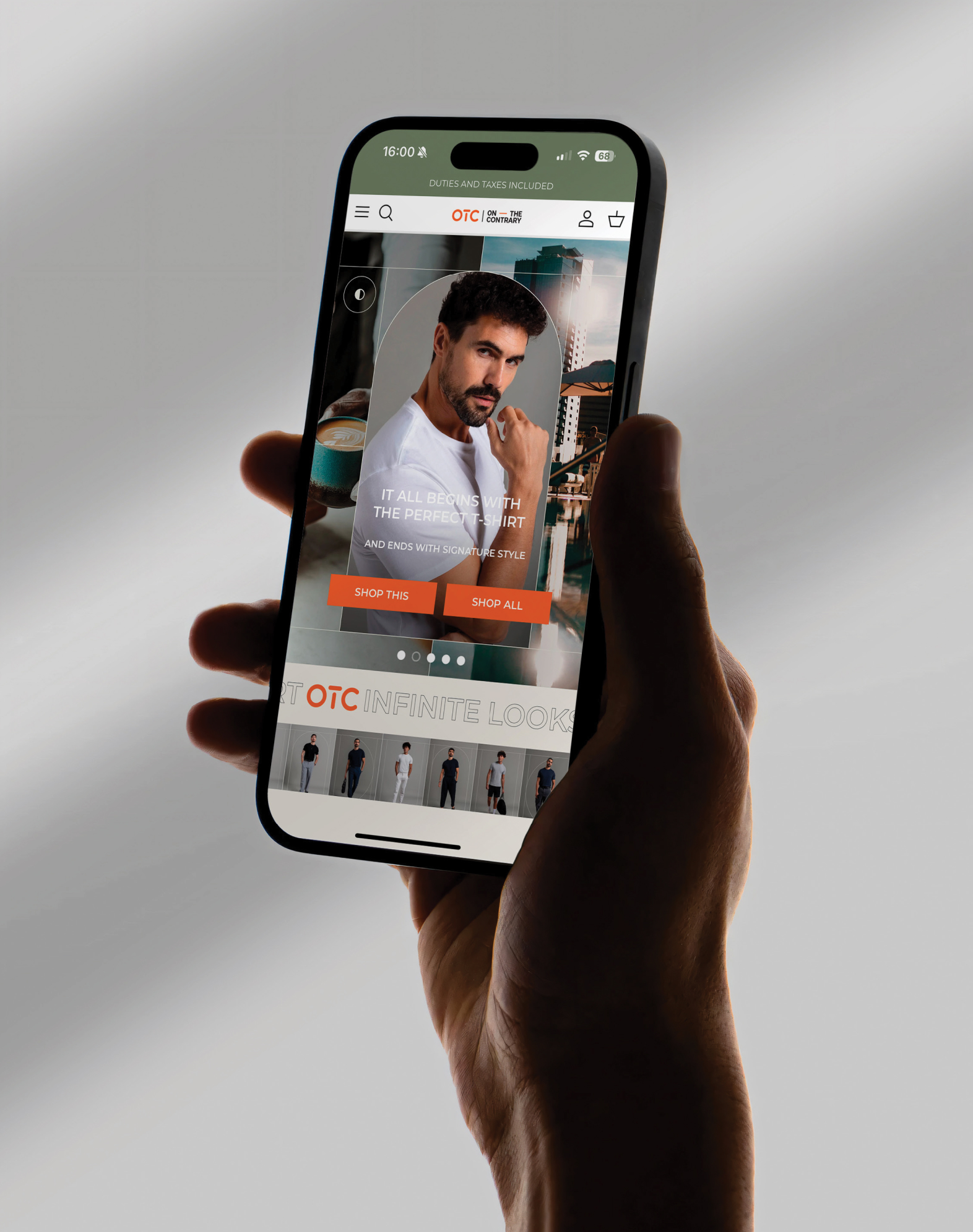
OTC | ON — THE CONTRARY
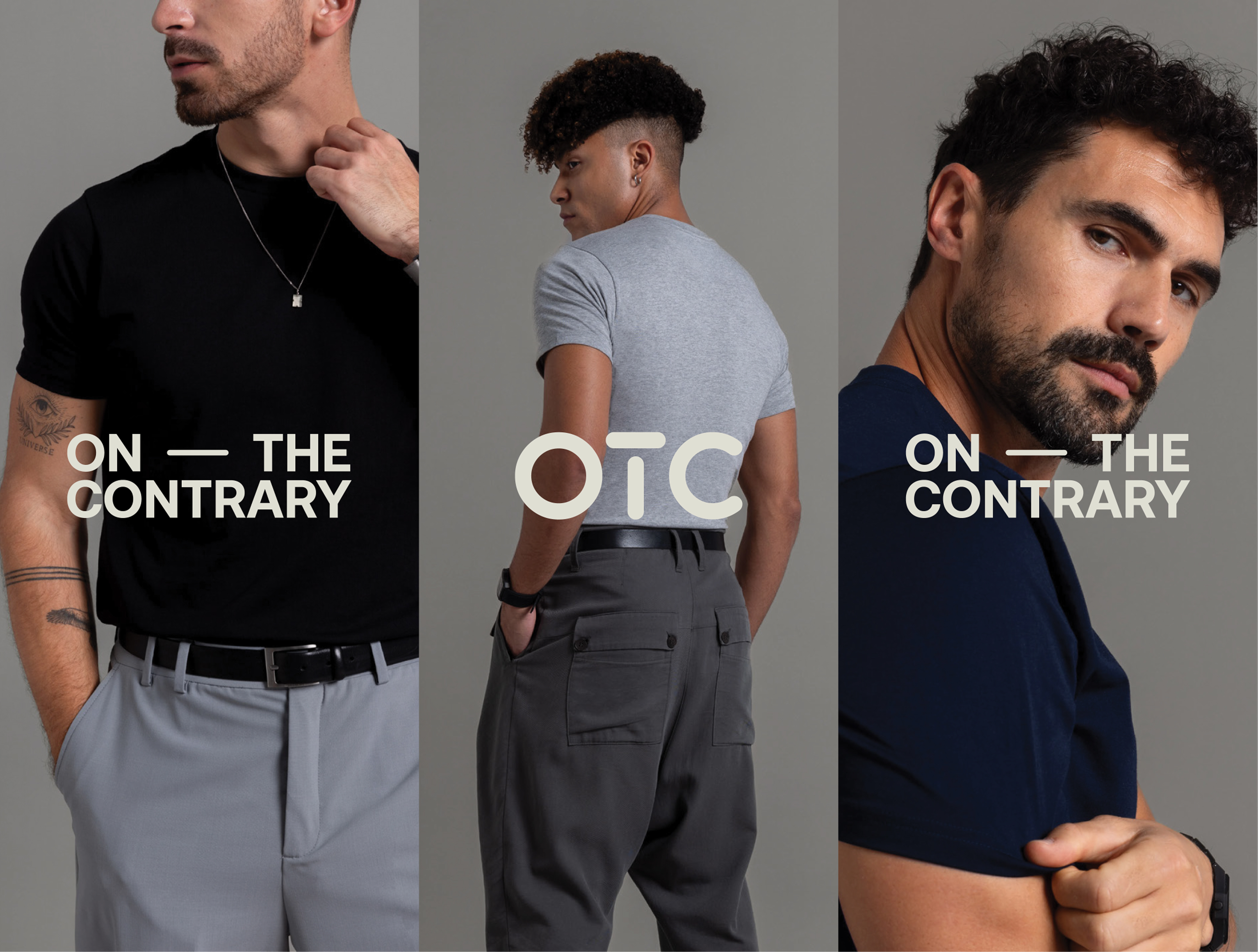
On The Contrary was created to reset the standard for modern menswear staples. OTC exists for those who see style as a daily essential, and needed a brand that matched that conviction.
A Mark of Attitude
The logo combines two distinct parts: a custom-drawn monogram with rounded letter forms that balance utility and warmth, paired with an all-caps wordmark that is structured and direct. The en dash between "On" and "The Contrary" acts as a hinge—a moment of pause that mirrors the brand's ethos of thoughtful disruption.
.jpg)
.jpg)
Toned With Intent
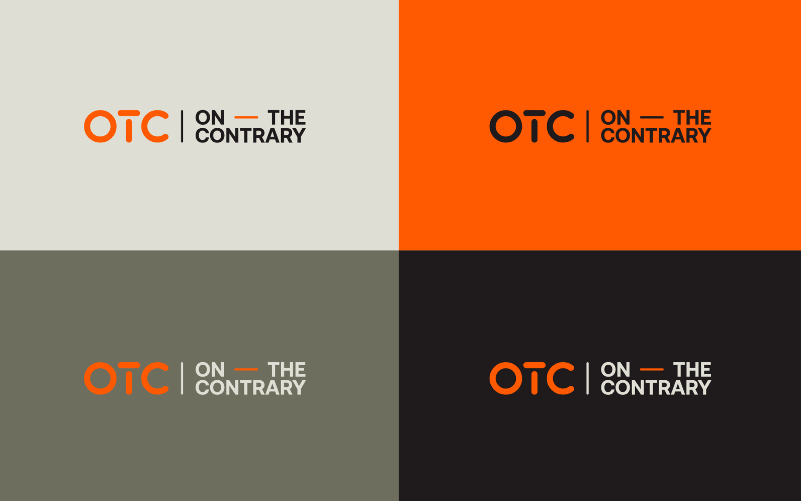
OTC’s primary palette strikes add liberate balance of contrast and cohesion—clean, versatile, and grounded in emotion.
OTC Black for weight and clarity
OTC Orange as the signature spark of energy
Light Cream for space and relief
Dim Gray for structure.
.jpg)
.jpg)
Modular by Design
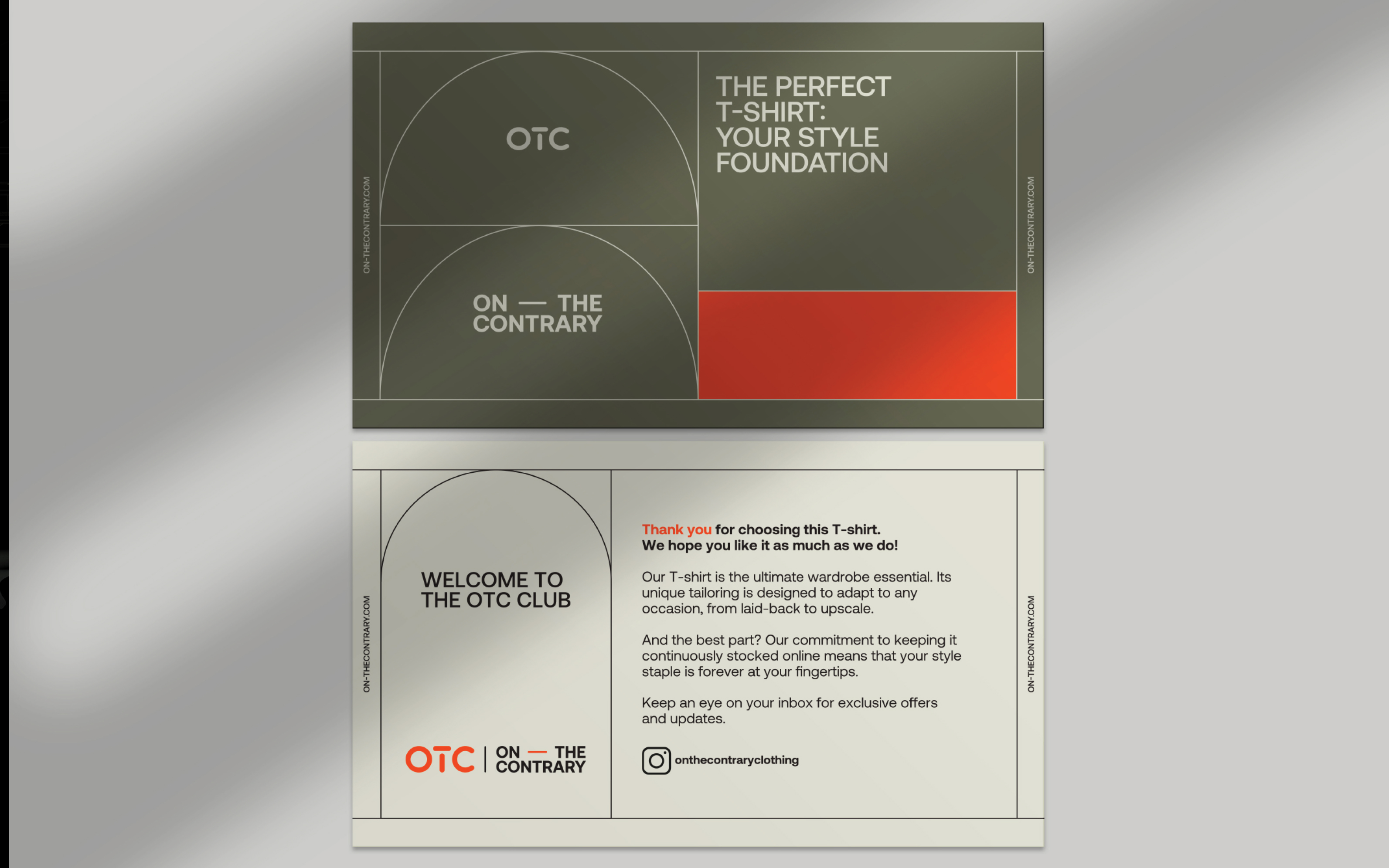
OTC’s graphic systemis infinitely adaptive. Its structure draws inspiration from sewing patterns—those precise, intentional lines—and subtly nods to tennis courts, a reference to the founders’ personal passions.
.jpg)
.jpg)
.jpg)