TAQA Operating Companies
POWERING A THRIVING FUTURE
4 INDEPENDENT GIANTS, ONE SEAMLESS PORTFOLIO
When TAQA Group established its new brand identity, the journey was just beginning. The next challenge was far greater: bringing four of the region's most powerful energy and water companies into a single, unified brand architecture. TAQA Transmission, TAQA Distribution, TAQA Water Solutions, and TAQA Energy Services—each a giant in its own right—needed to speak with one voice, reflect onevision, and carry the weight of a world-class group on the global stage. Four independent brands. One unified future.
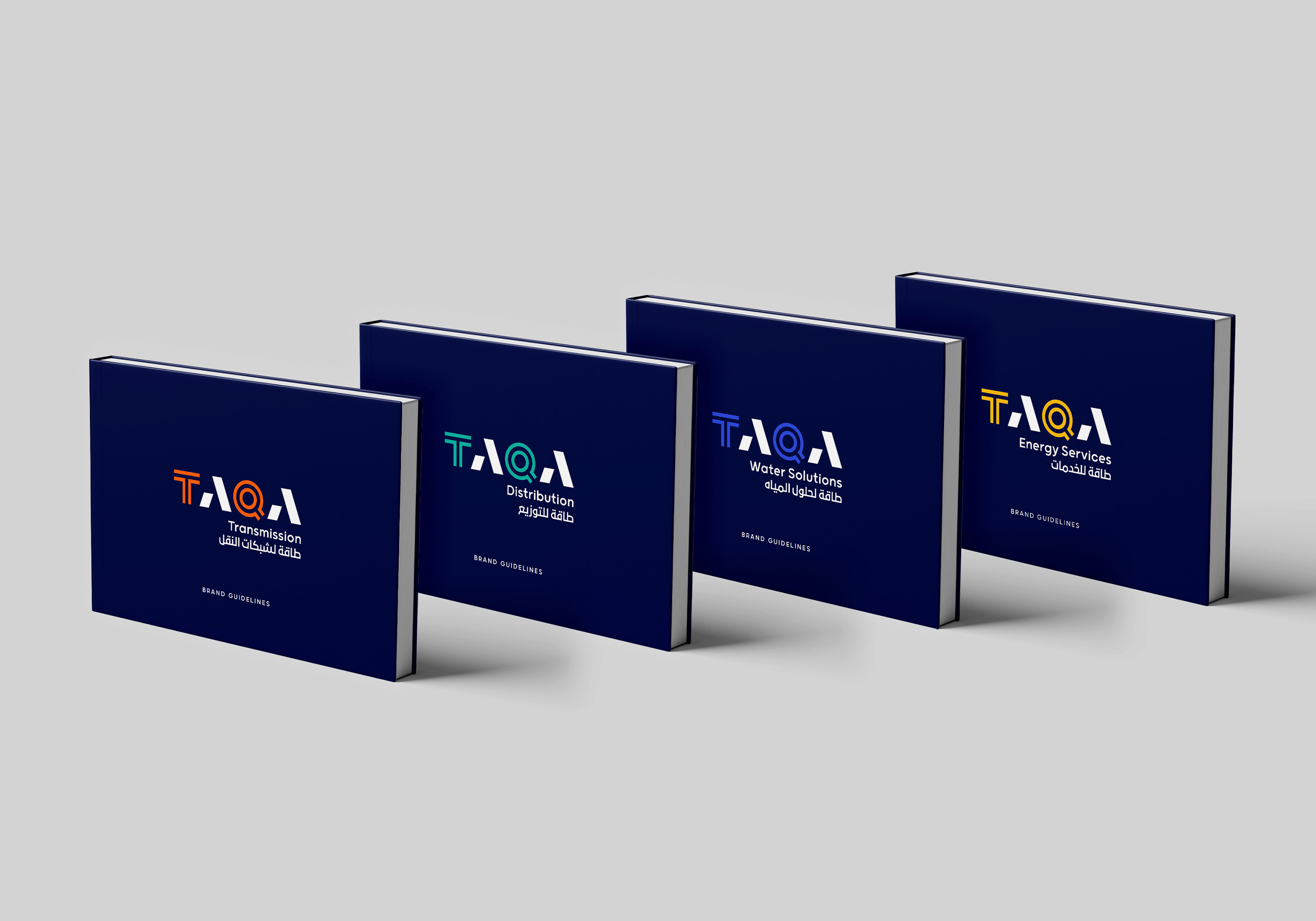
Unified Yet Unique
Each brand also has its unique colours, patterns, graphic systems, verbal drivers and visual references that further establish the distinction every brand requires. The result is an interconnected visual language that expresses unique visions within a united ecosystem.
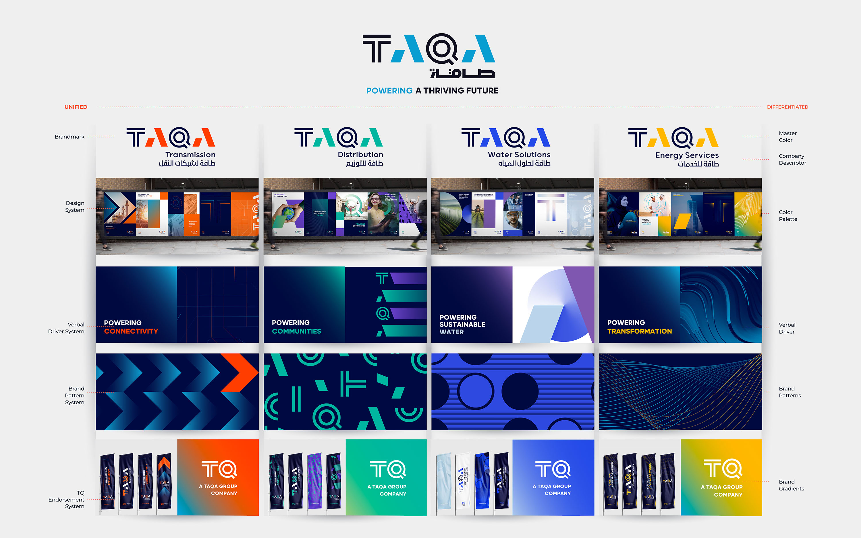

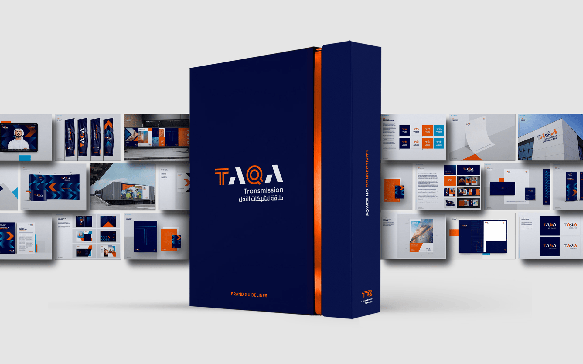
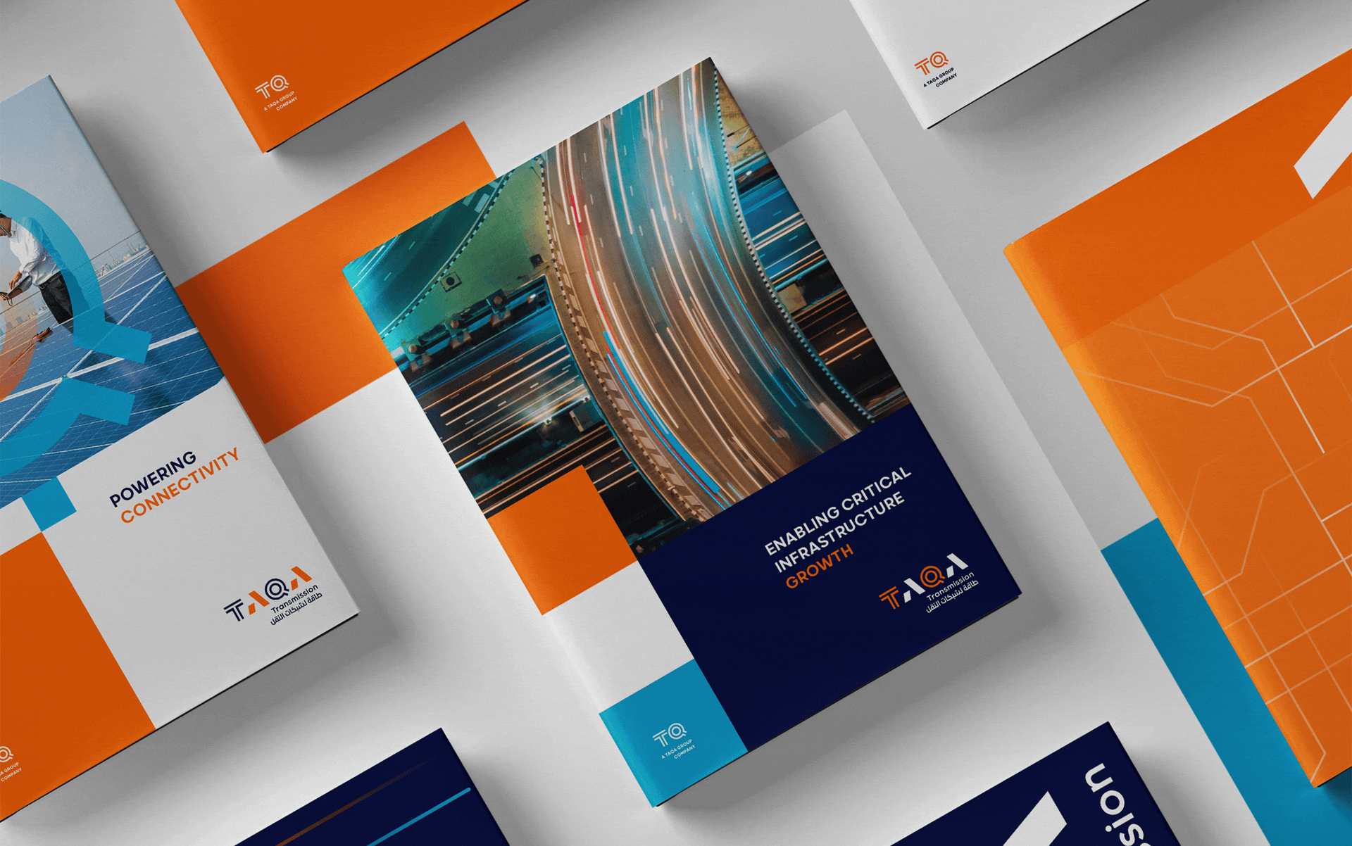
TAQA TRANSMISSION
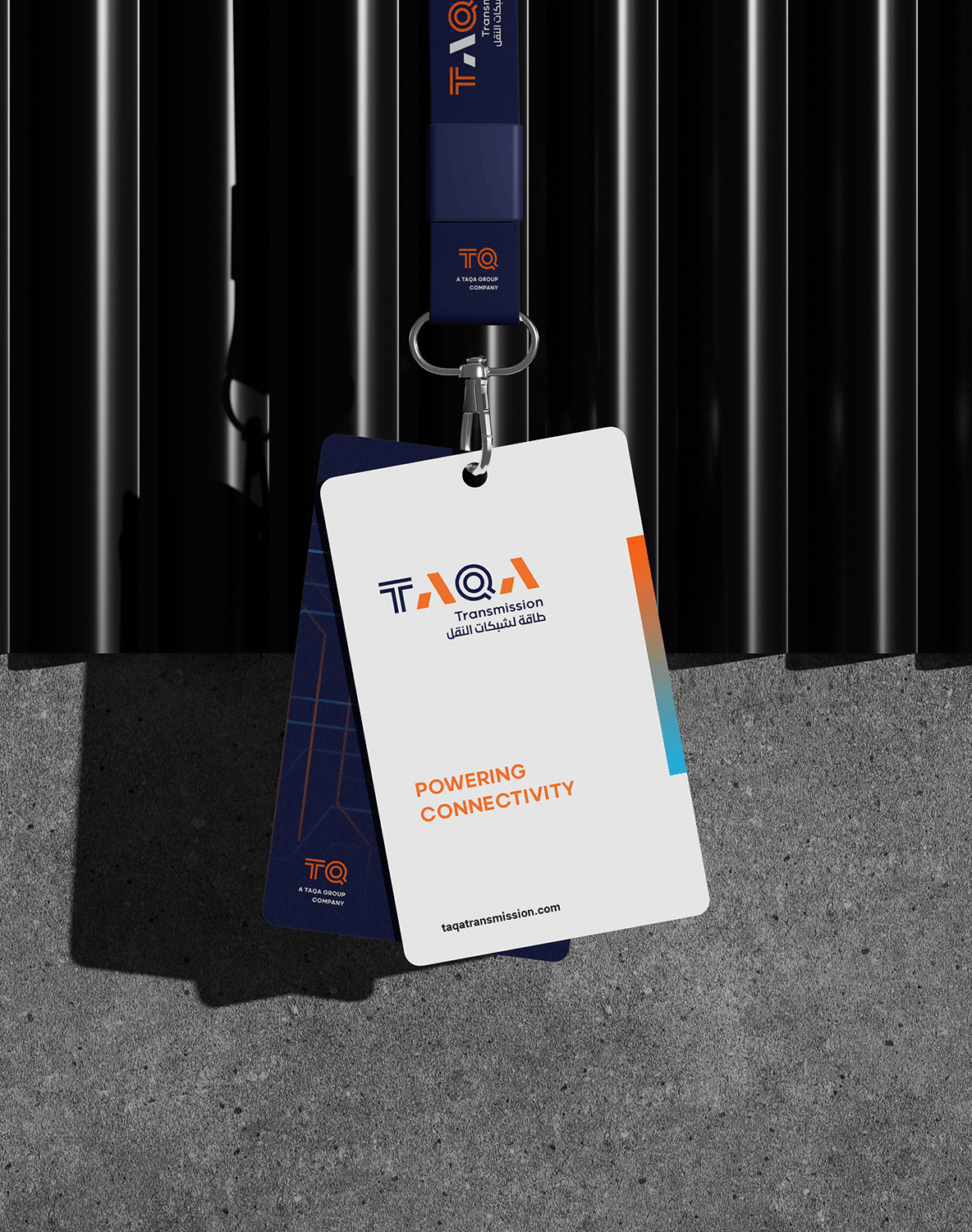
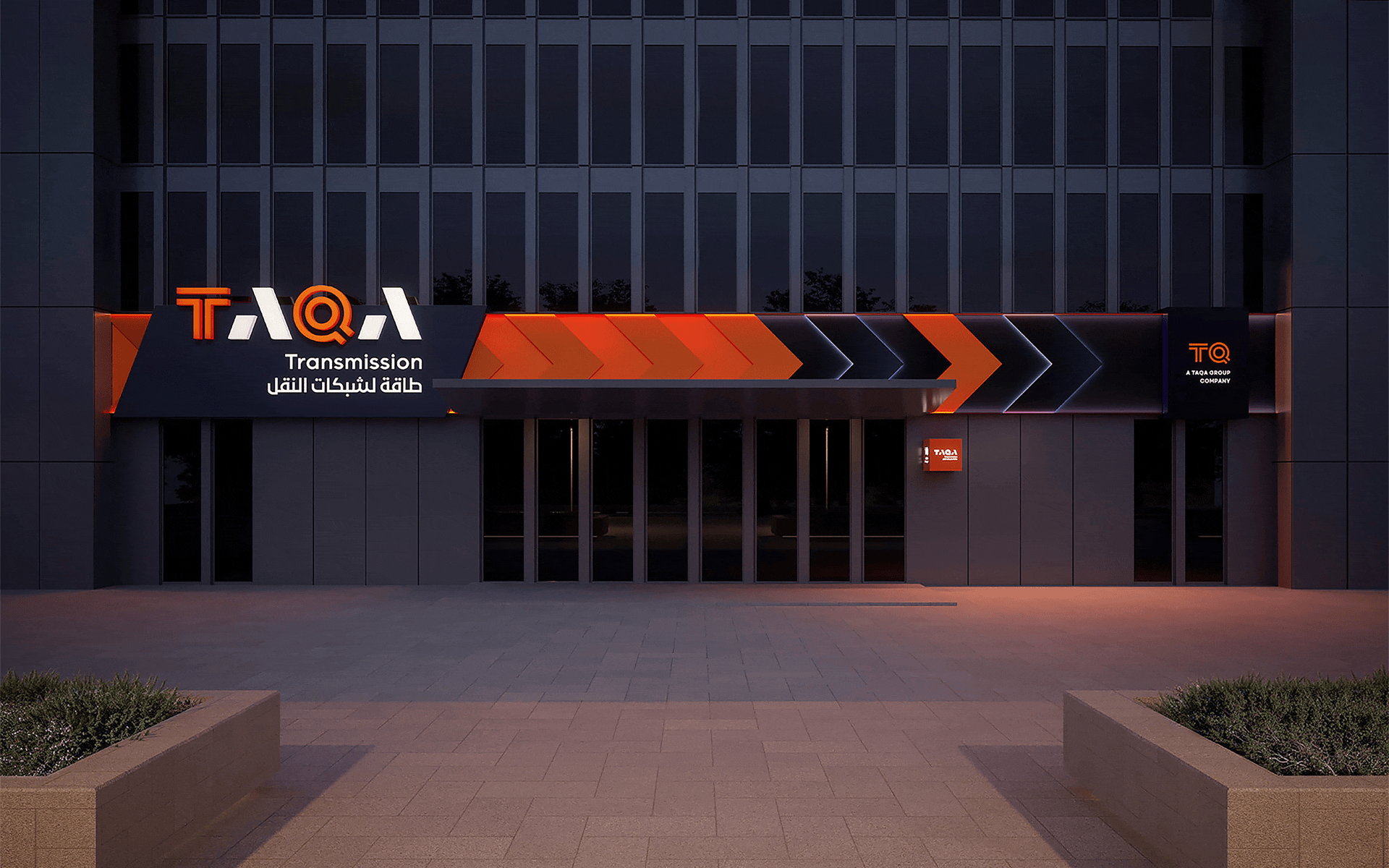
TAQA Transmission is responsible for the planning, construction and operation of the transmission network used to transmit water and electricity throughout the country. Our purpose was to bring their industrial strength and forward-energy tone within their brandworld.
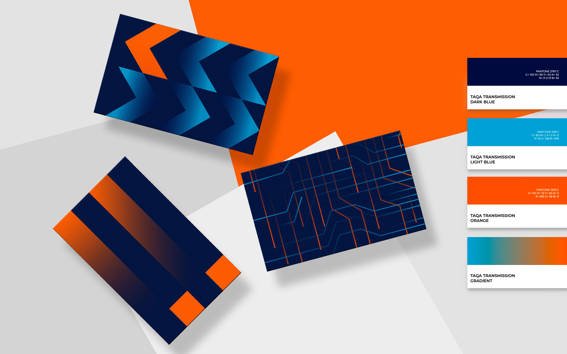
ORANGE. ARROWS. GRID. CONNECTIVITY
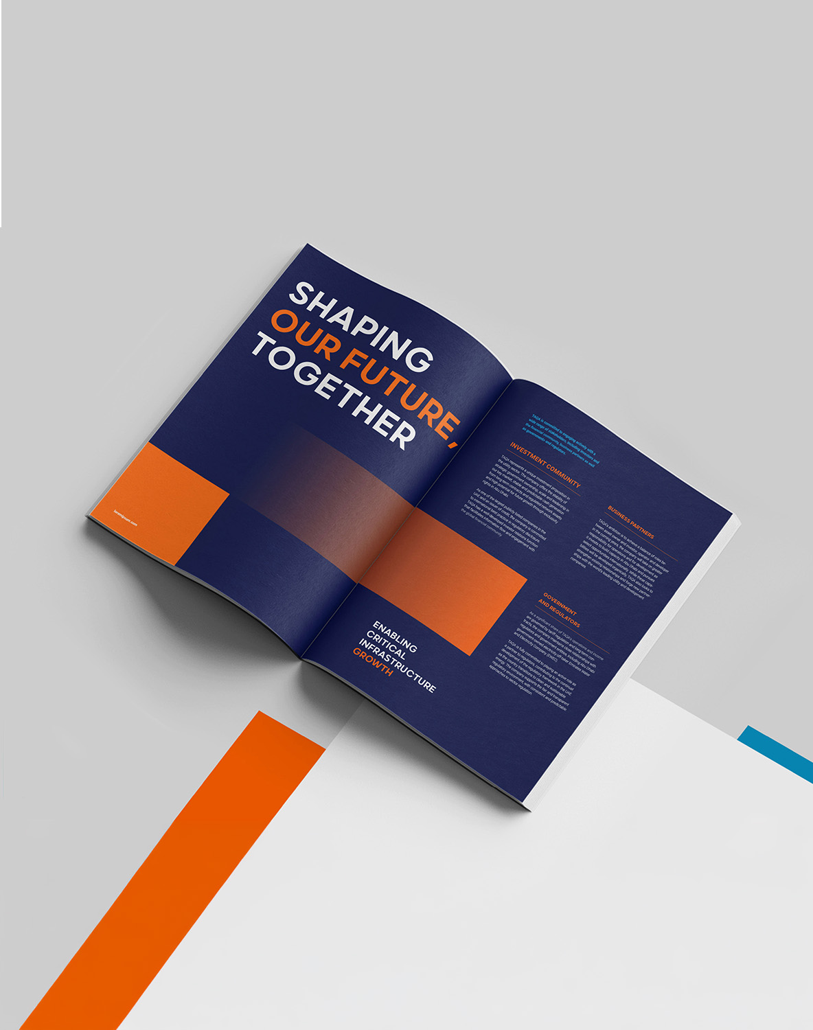
Orange drives the brand forward: bold, energetic, and unapologetic. Light blue steadies it — clean, clear, and stable — while the gradient between the two captures the exact moment water meets energy inmotion. The Arrow pattern translates all of this into visual form, depicting the bidirectional flow of power and water across the grid. Dynamic and directional, it's an exclusive mark that lives at the heart of the brand's identity. Every color choice, every arrow, every line on the grid leads to thesame place — Powering Connectivity.
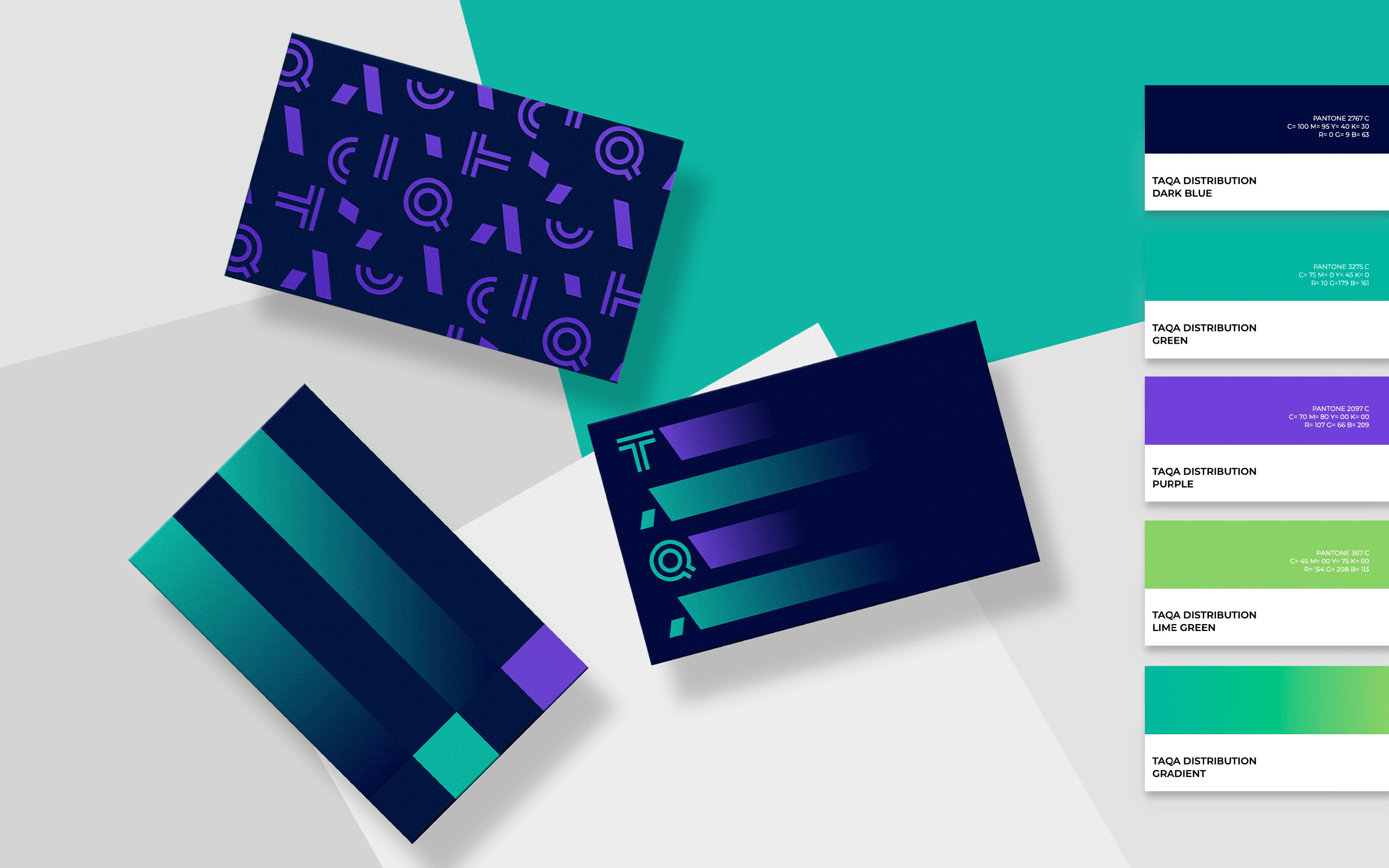
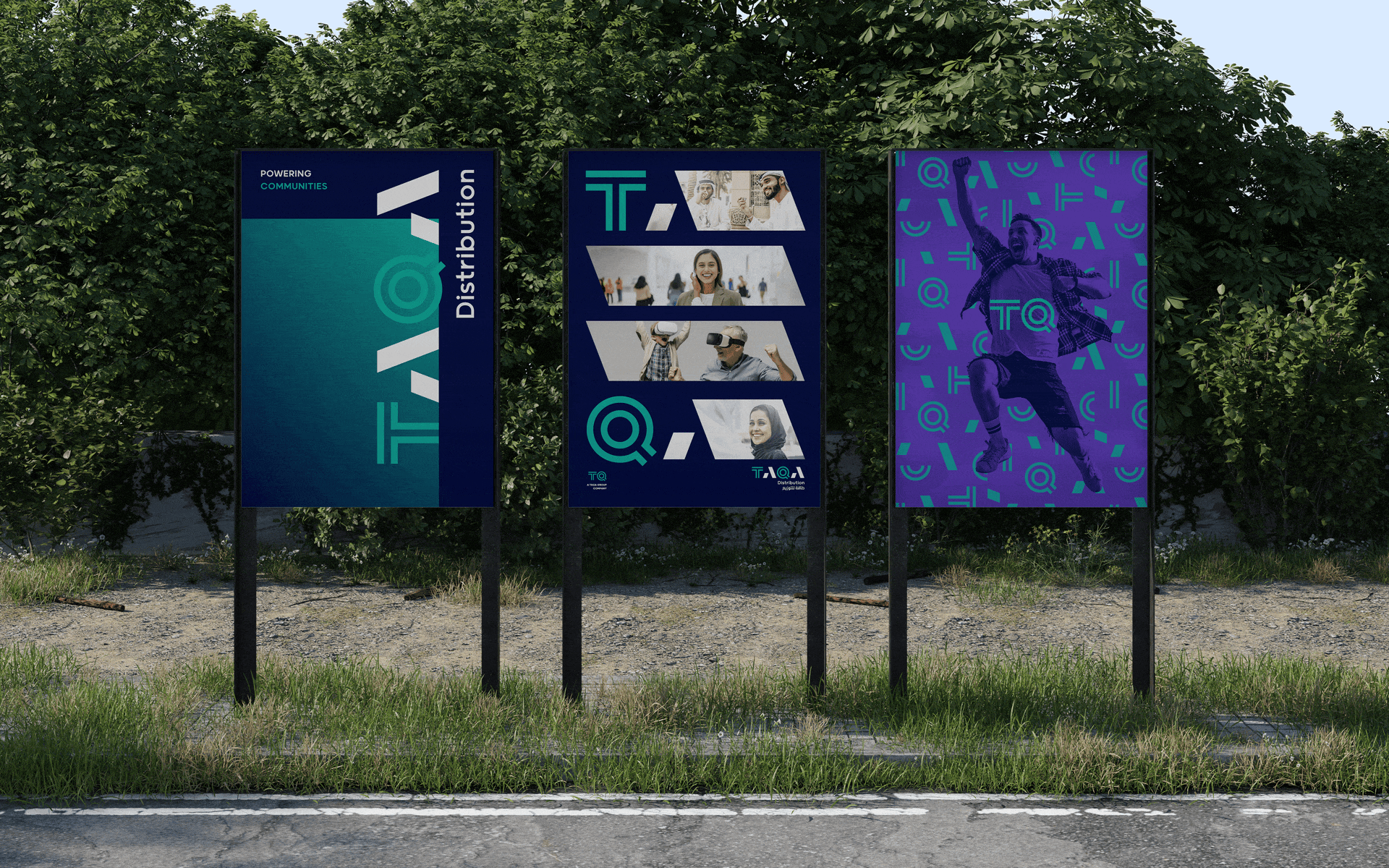
TAQA DISTRIBUTION
TAQA Distribution plans, operates, maintains and owns network distribution assets and directly interfaces with power and water customers in Abu Dhabi and Al Ain. Our purpose was to bring their community first strategy and sustainable tone within their brand world.
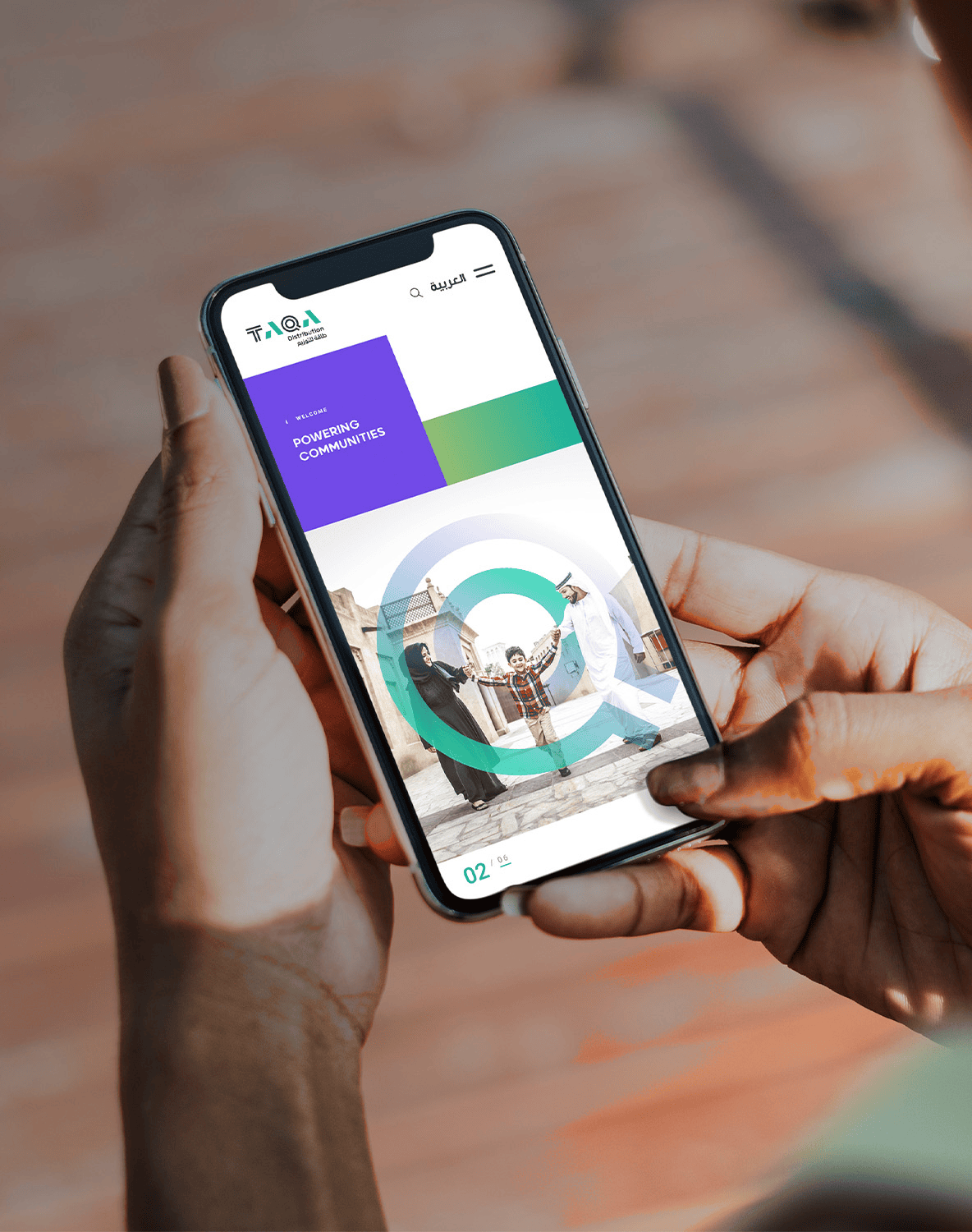
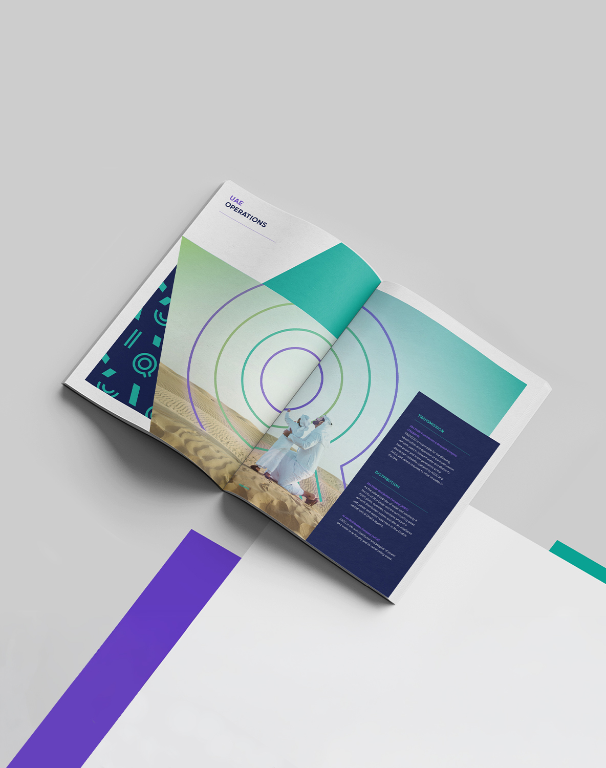
GREEN. CONFETTI. COMMUNITIES. PEOPLE.
Green anchors the brand with reassurance — calm, clean, andsteady, it speaks to the energy that flows reliably into homes and communities every day. Purple adds depth: credibility, innovation, and wisdom woven into every touchpoint. And as the gradient shifts from green to lime, it mirrors the brand's own movement — from stable infrastructure to vibrant, living communities. The pattern brings it all to life. Drawn directly from the letters of the TAQA wordmark, the confetti-like master pattern scatters each letterwith intention — energetic, celebratory, and completely ownable. TAQA Distribution isn't just managing networks, it's touching lives — Powering Communities.
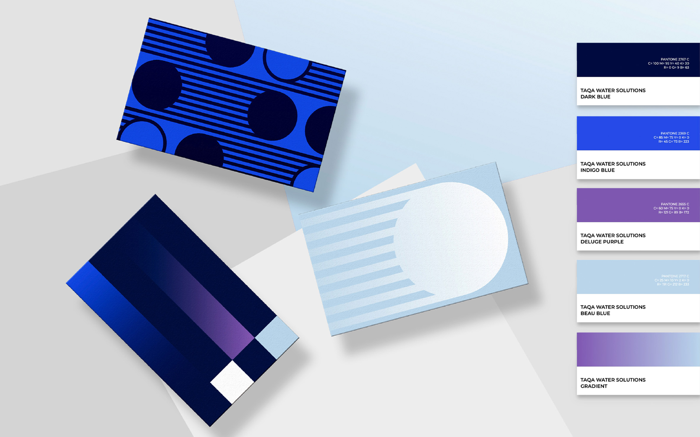
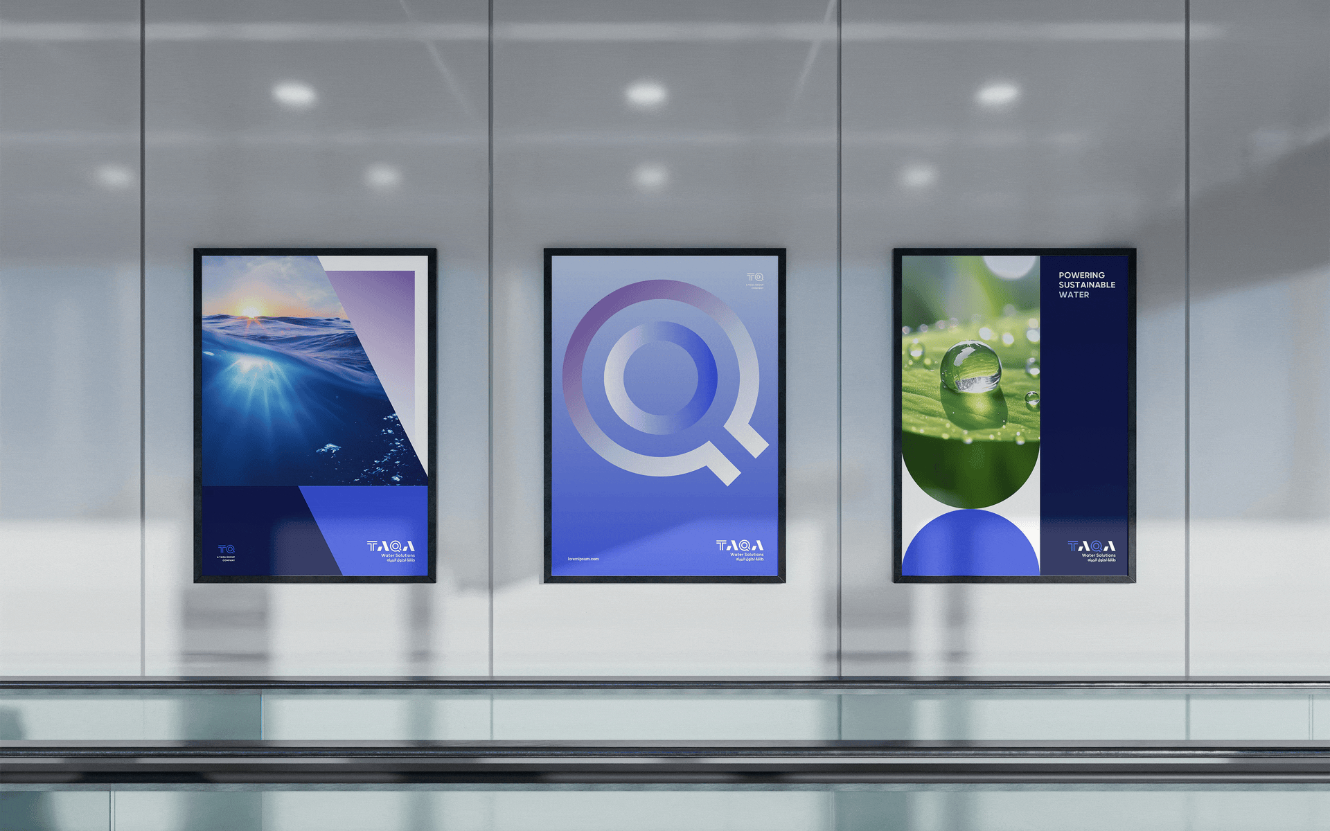
TAQA WATER SOLUTIONS
TAQA Water Solutions specialises in sustainable water solutions to transform one of our most valuable natural resources, contribute to sustainable economic development, and improve the quality of life. Our purpose was to bring their focus on cleanwater and sustainable goals within their brand world.
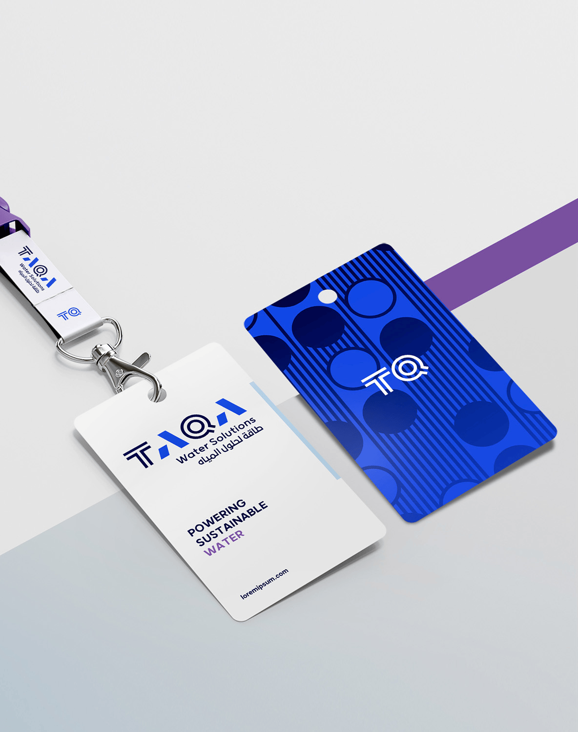
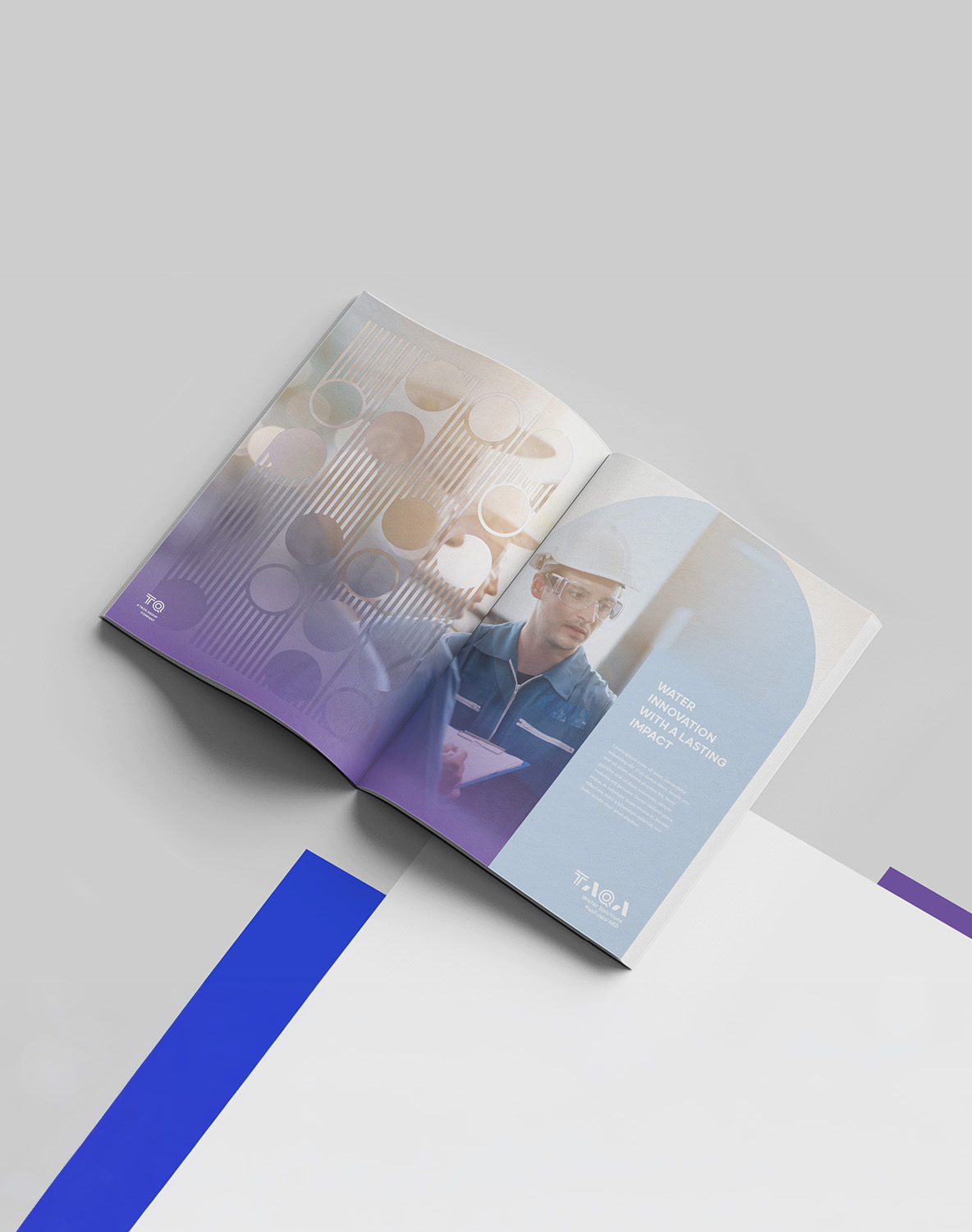
BLUE. FLOW. RENEWAL. NOURISHMENT
Indigo Blue opens the brand with depth and dynamism — modern, forward-thinking, and built for the future. Deluge Purple adds merit and bravery, a reminder that transforming one of the world's most vital resources demands bold conviction. As the gradient transitions to Beau Blue, the identity softens into purity and serenity, mirroring the very nature of water itself —clear, essential, and life-giving. The Circles pattern carries this philosophy into form. Fluid and interconnected, each circle represents the continuous cycle of water's ecosystem, while the connecting lines form bonds between elements — balancing structure with flow in a design system as considered asthe solutions behind it. Every visual choice points to the same truth — Powering Sustainable Water.
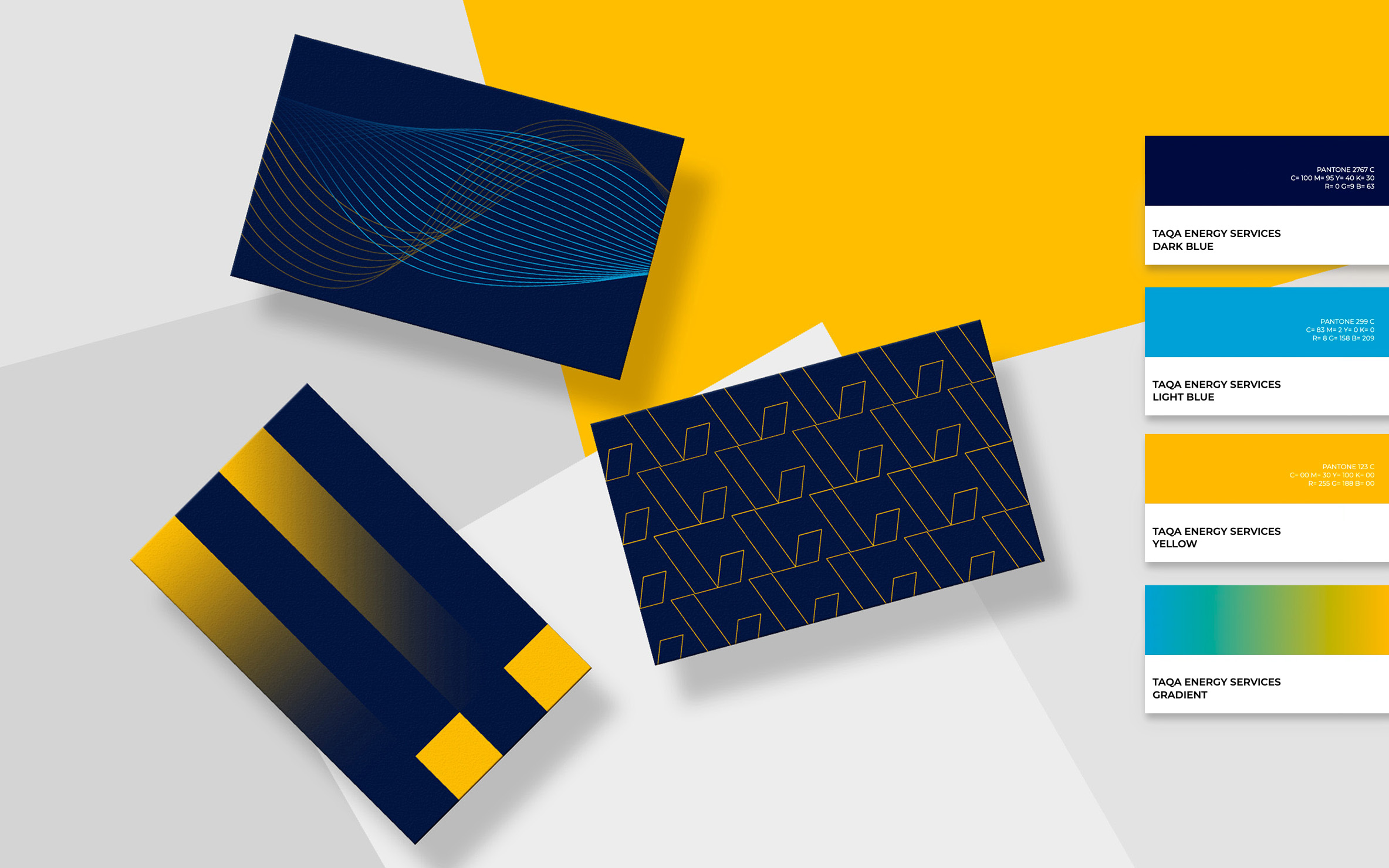
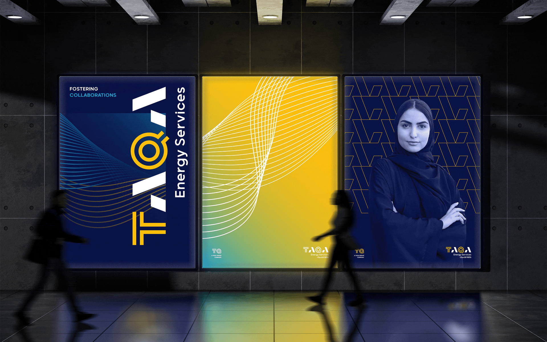
TAQA ENERGY SERVICES
TAQA Energy Services is a Super ESCO (energy services company) that simplifies and accelerates the development of water and electricity efficiency projects in government and private sector buildings across the Emirate of Abu Dhabi. Our purpose was to bring their efficiency-led mentality and seamless collaboration within their brand world.

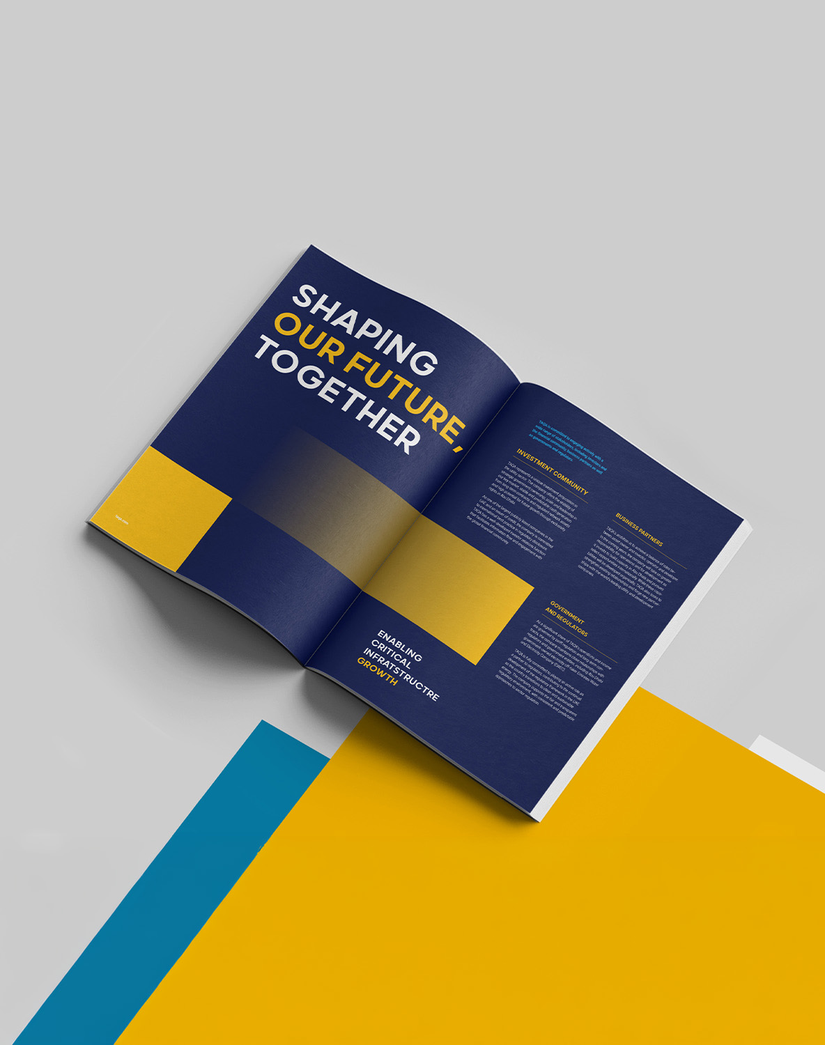
YELLOW. WAVES. TRANSFORMATION. INNOVATION.
Yellow sets the tone — radiating optimism, solution-driven energy, and the confidence of a brand that exists to accelerate change. Light blue grounds it with clarity and stability, and as the gradient flows from blue into yellow, it traces the brand's own journey: from visionary thinking to dynamic, impactful solutions. The Waves pattern brings that transformation to life — fluid yet precise, modern yet purposeful. Depicting the continuous flow of both power and water, the waves move with intention, embodying the forward-thinking spirit of a company built to simplify complexity and drive efficiency across Abu Dhabi's built environment. Every element of this identity points in one direction — Powering Transformation.
4 GUIDELINES, 1 SYSTEM
Brand Guidelines were developed as a clear, practical frame work for implementing and maintaining the identity system across all four brands —covering visual identity, tone of voice, brand architecture, and stylized applications. Delivered as an intuitive digital resource, they ensure every team, agency, and partner can apply the new identity correctly and consistently from day one.