Taqa
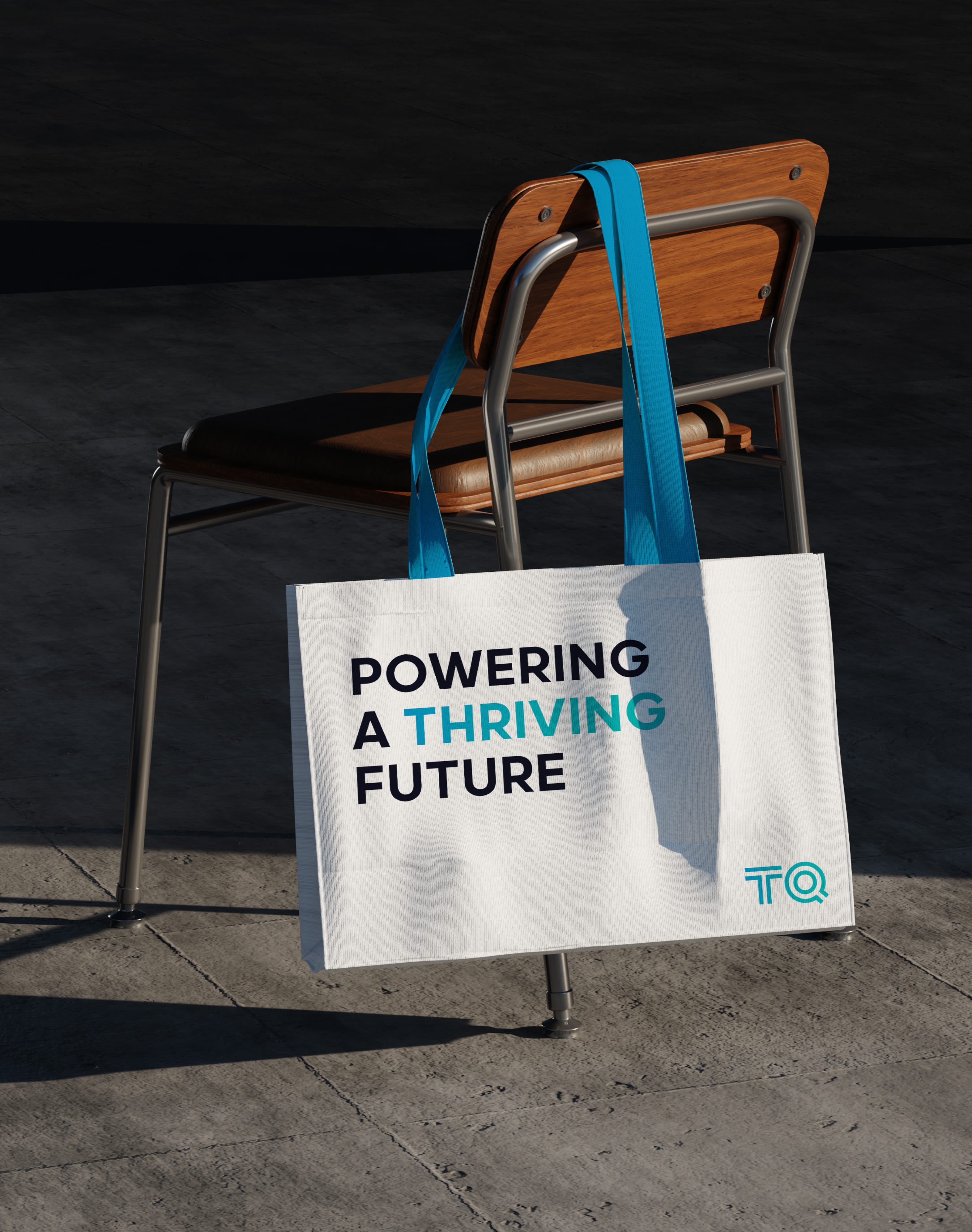
POWERING A THRIVING FUTURE
From Local power to global Legacy
TAQA’s transformation began with the landmark merger of ADPower and TAQA, creating one of the region’s most influential energy and water champions. This new scale demanded a global-level identity, one that reflected the Group’s ambition, unified its diverse subsidiaries under its brand portfolio, and strengthened its presence on the world stage.
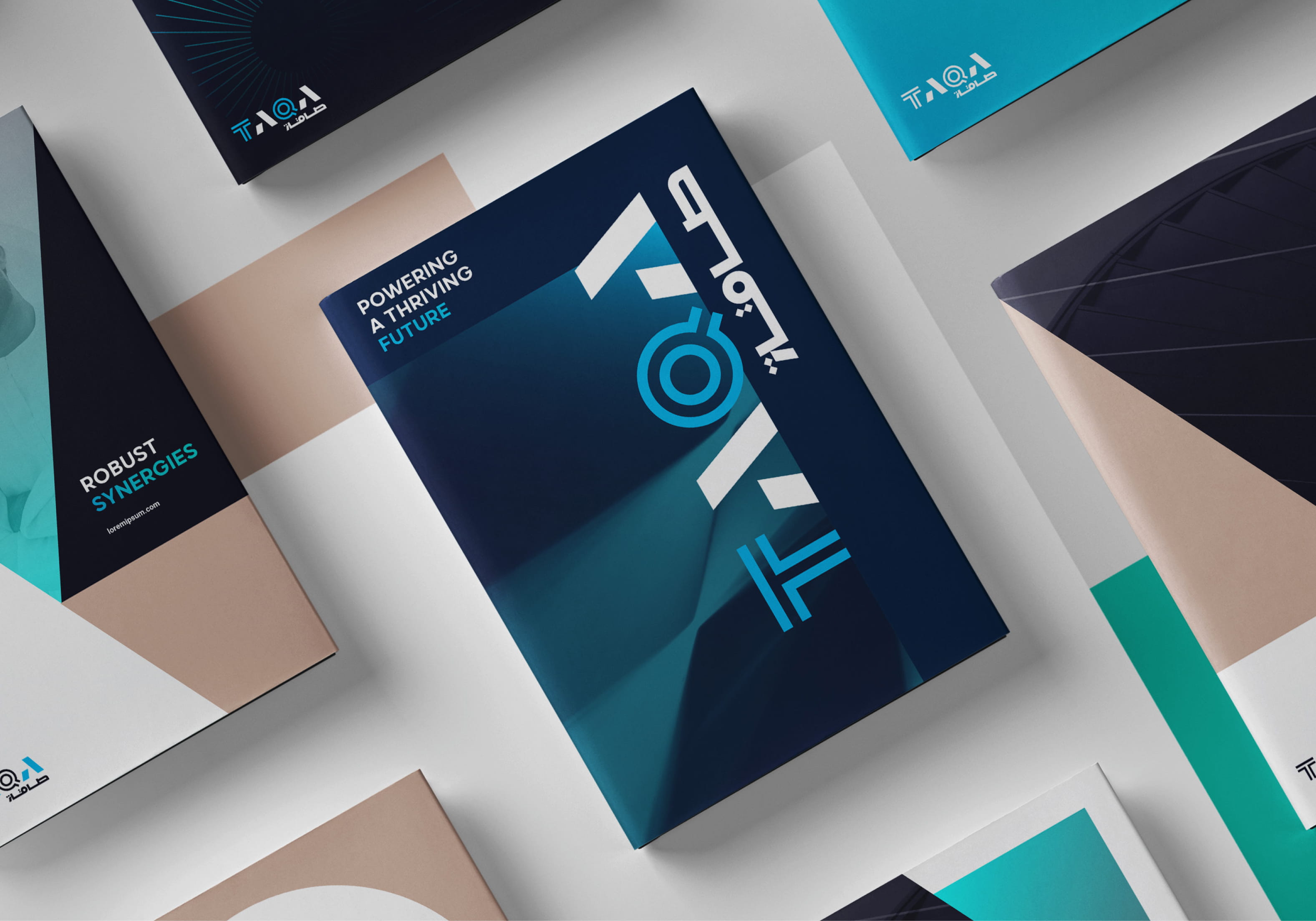
A dynamic Expression of robust Power
The new brand captures TAQA’s duality, forward-looking, sustainable, and agile, yet firmly rooted as a stable, robust, and efficient integrated utilities leader.
Look Intelligent, Feel electric
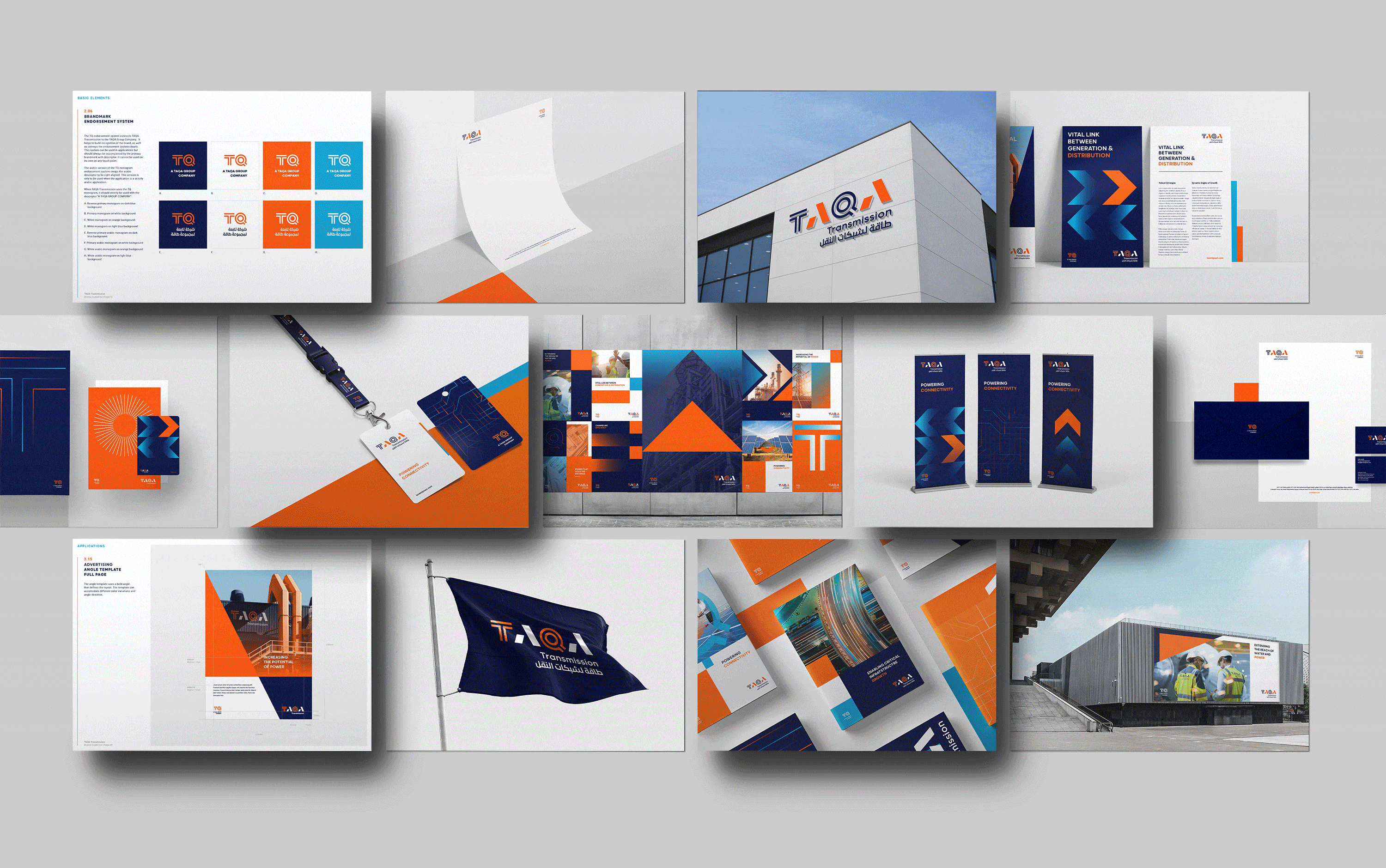
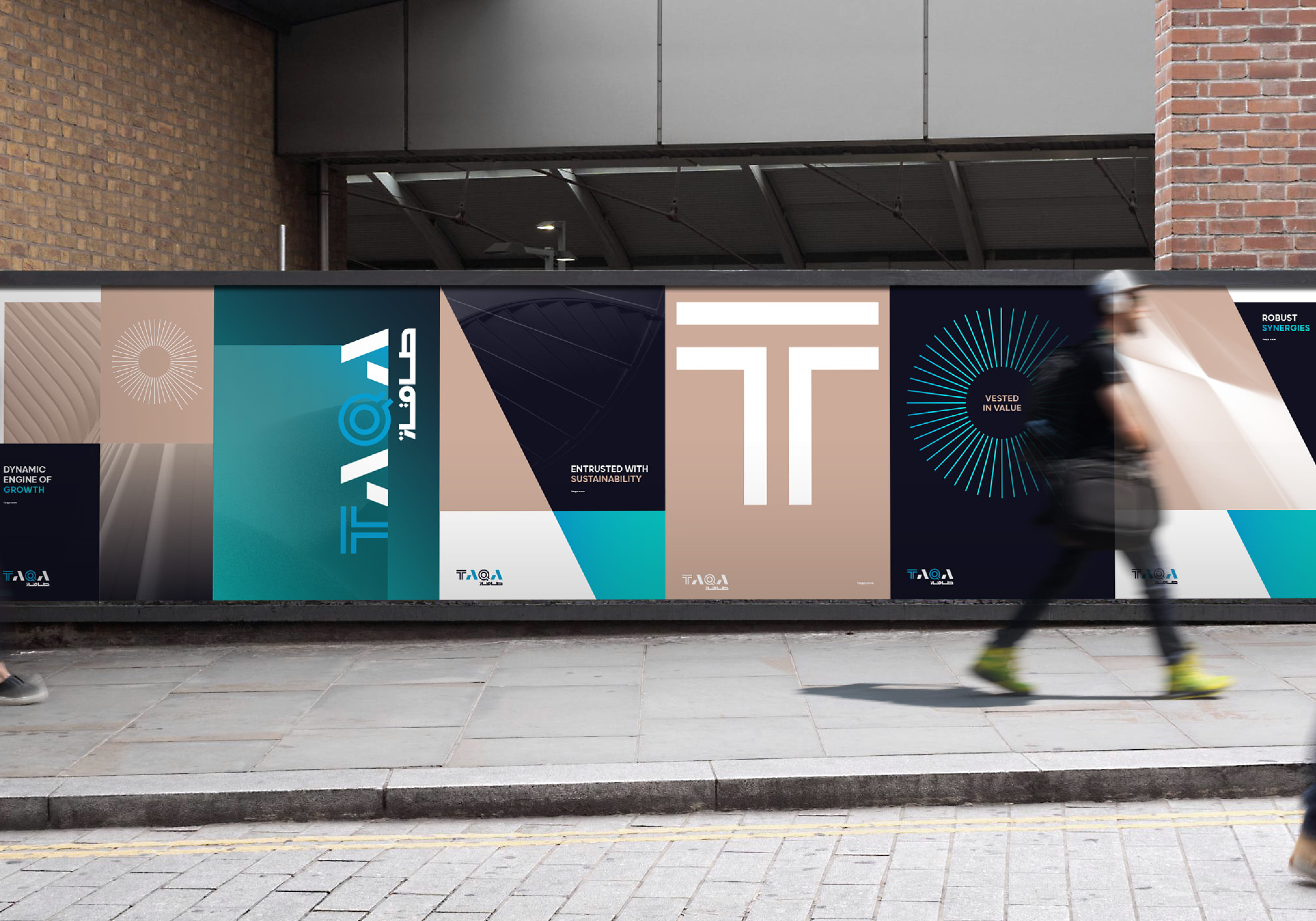
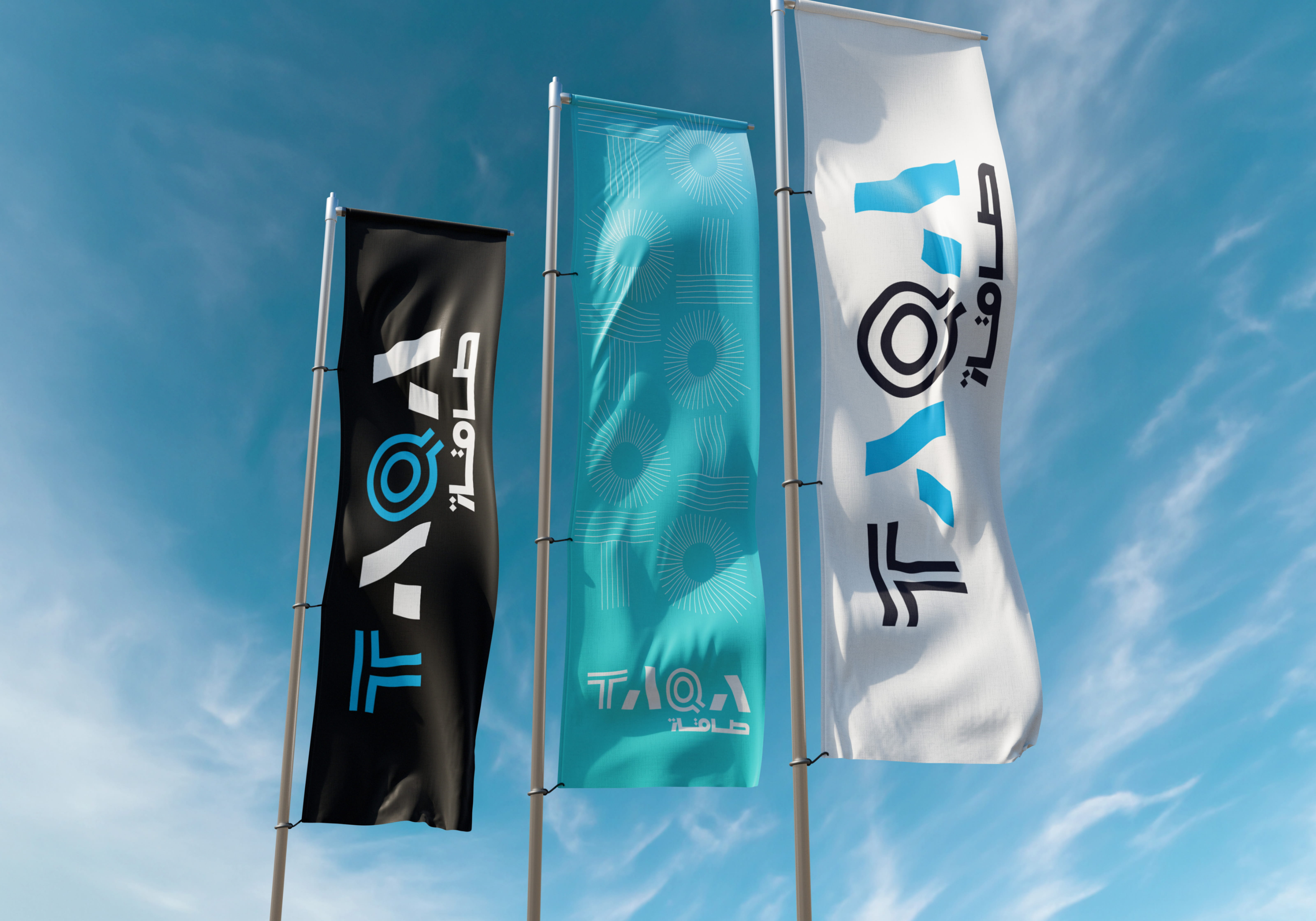
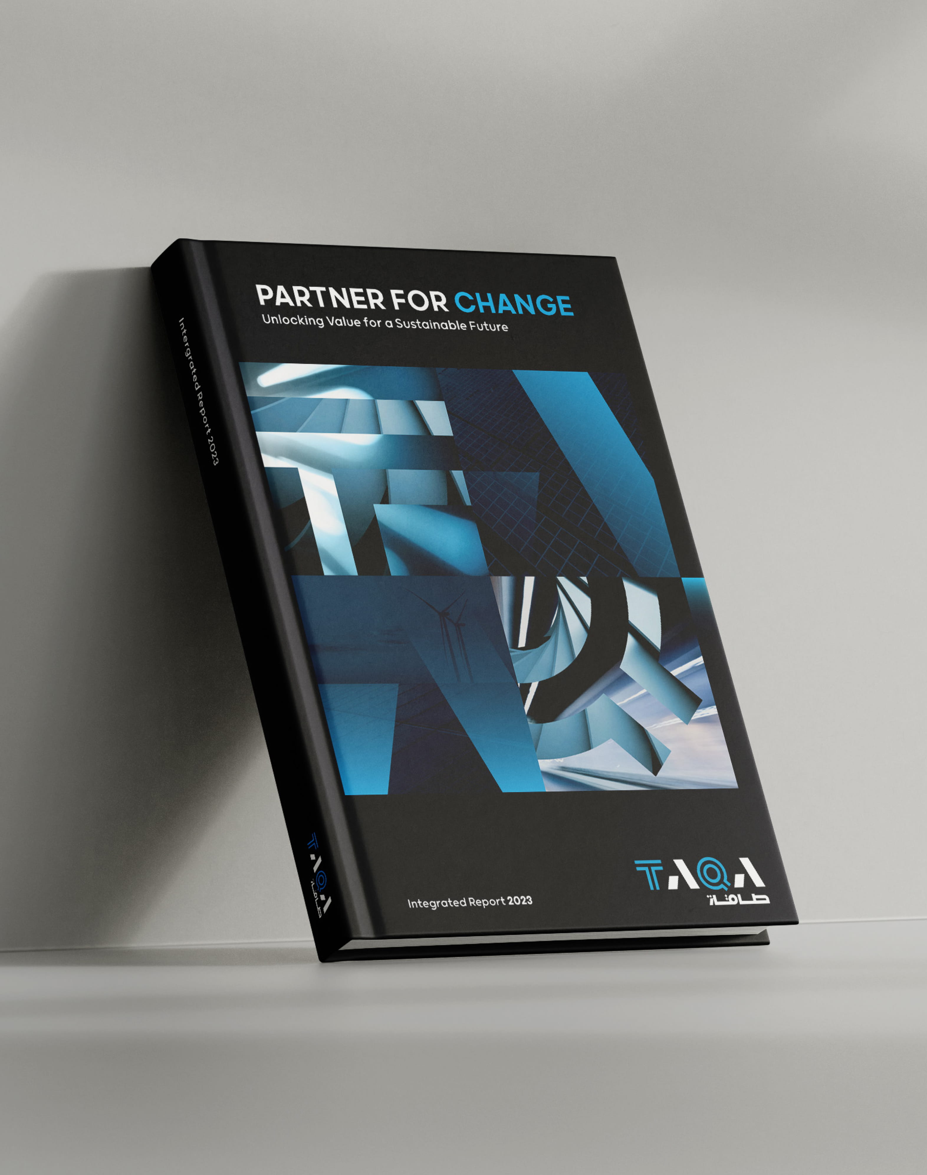
TAQA’s visual system is built from the core DNA of the logo, expanded into a bold, dynamic language that drives recognition and consistency. Each element is derived with intention, creating a cohesive toolkit that feels powerful, modern and unmistakably TAQA.
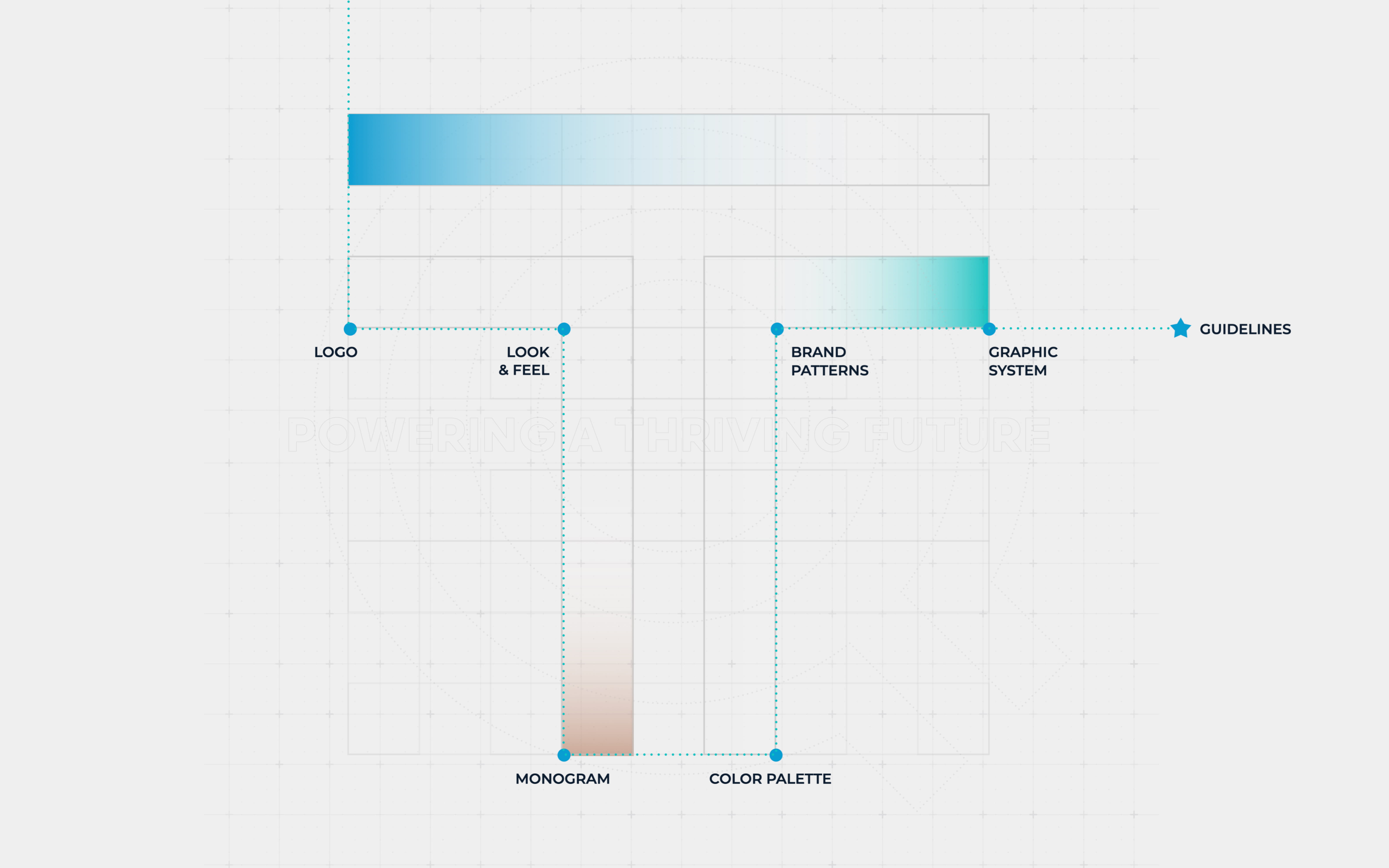
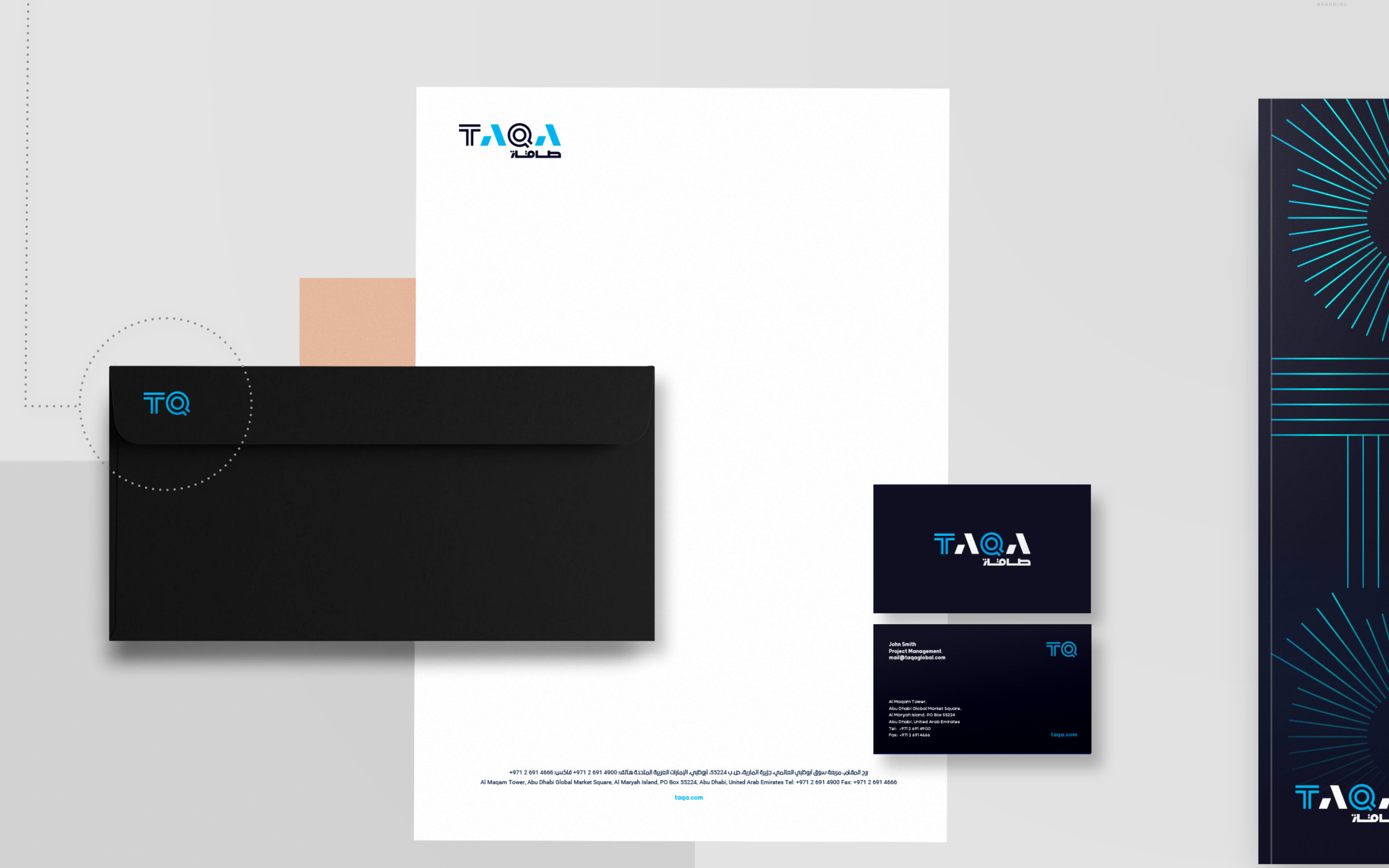
Secondary Monogram, Double impact
We derived TAQA’s monogram with a simple TQ, defining an instantly recognizable and impactful visual link, acting as a core brand signature.
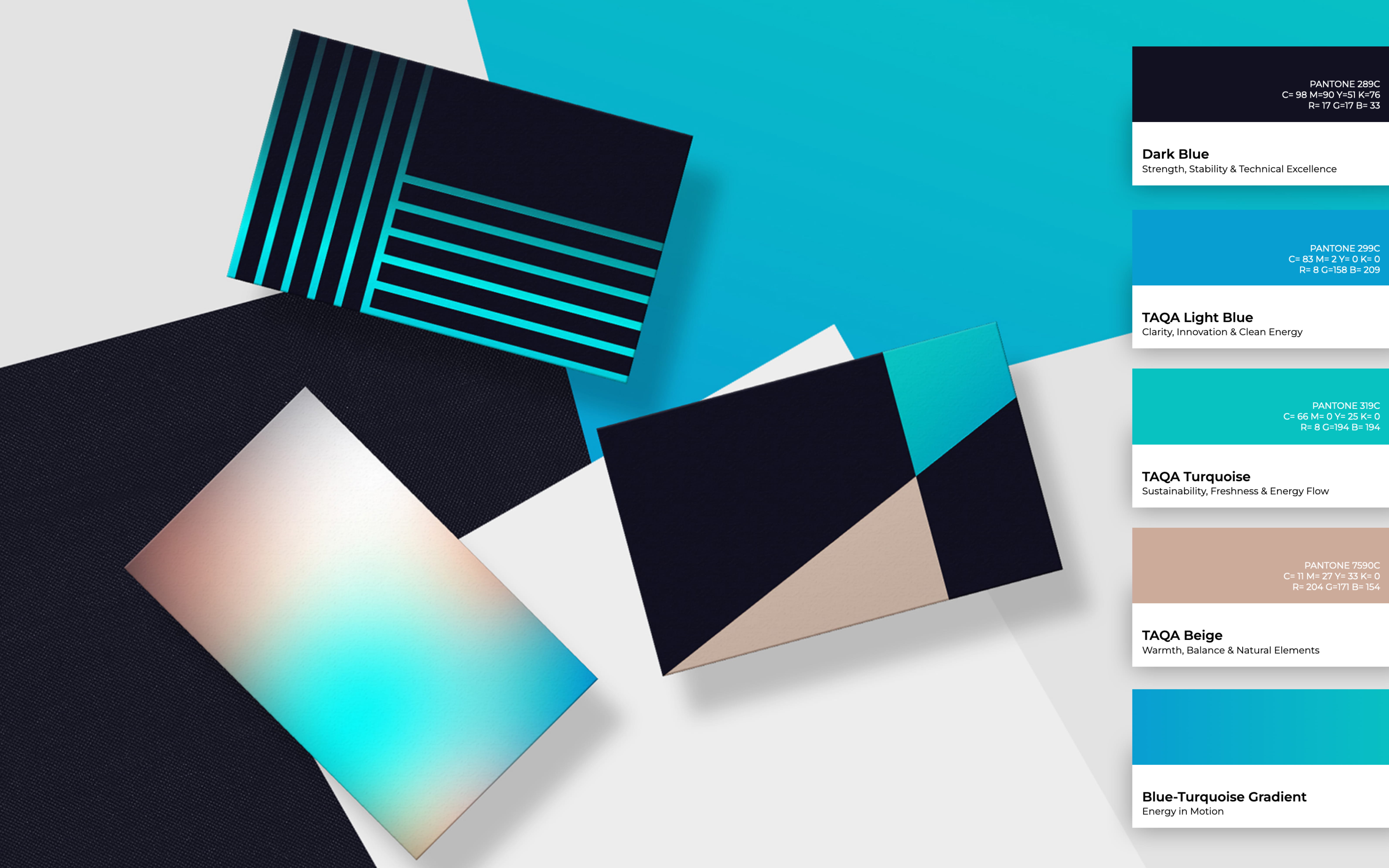
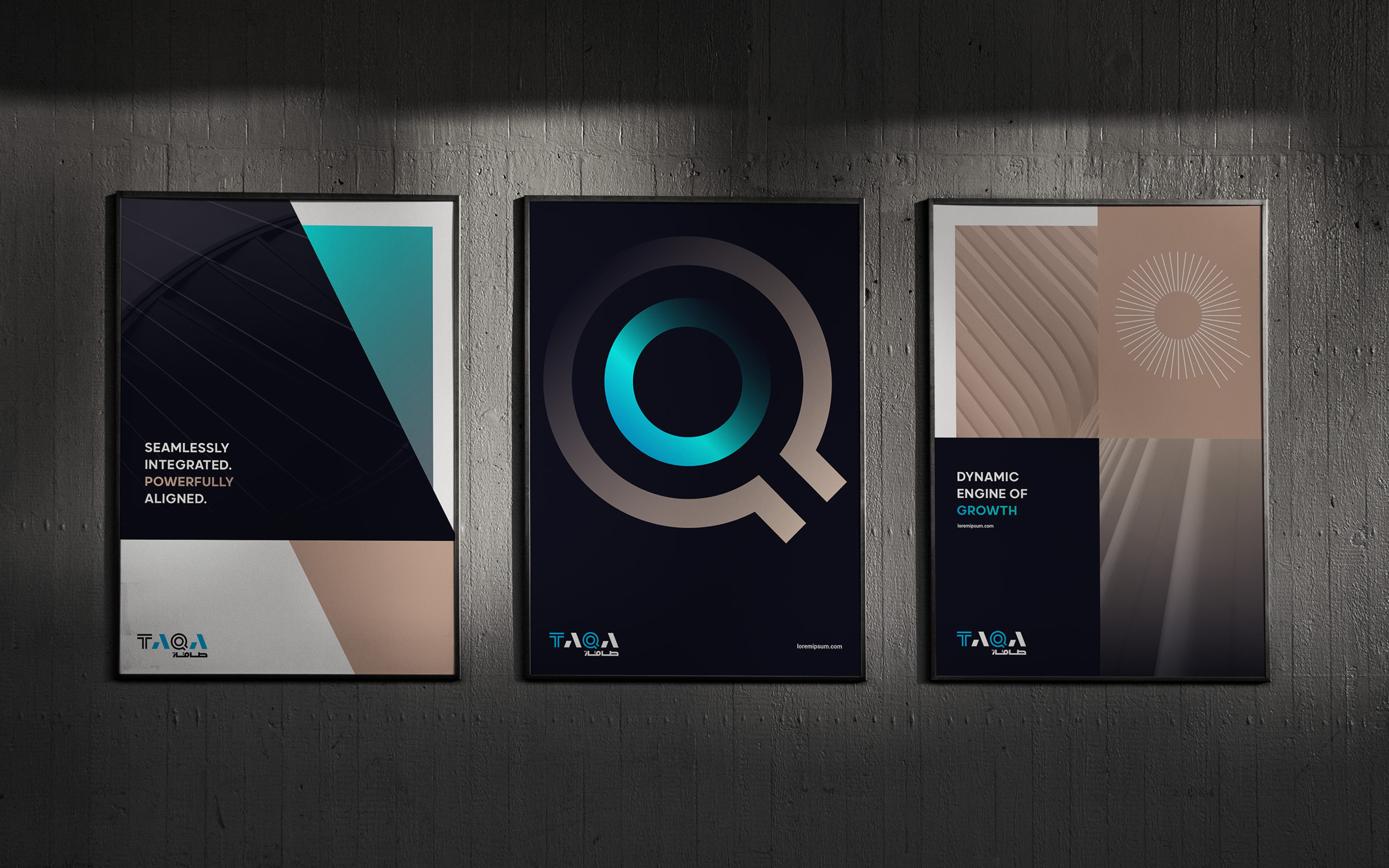
A Graphic system fit for a champion
Key graphic elements are used in brand communication to create a dynamic, flexible, and consistent brand image over a range of design applications:


.jpg)
Brand Guidelines From T to Q
The TAQA Brand Guidelines are a 120-page brand tool that equips all brand users with the essential components, systems, and guidance needed to implement the brand consistently and as intended.